Under the Stars Over the Moon
|
|
|
|
|
|
Starry Gaze for Hopeful Daze
I donated this piece to the Alzheimer's Gala. I created “Starry Gaze for Hopeful Daze” in honor of all who have been affected by Alzheimer’s. My inspiration for this piece came from often finding myself looking up at the stars in a sense of wonderment and often searching for an answer. Looking up and asking why? Sometimes drifting into a state of mind where all is right with the world. I hope this piece brings joy for all who see it and reflects a sense of comfort knowing there is always hope for the future.
The Gathering Place
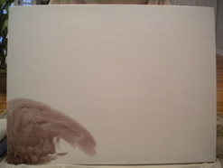
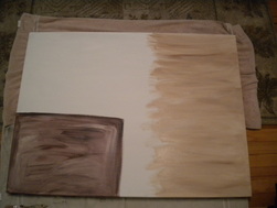
This is one of my biggest canvases to date! I created this piece for my parents family room. The room has lots of gorgeous neutral tones with a terracotta accent wall and deep rich colored furniture. I want this piece to bring out the accent wall and tie the room together.
|
|
|
|
|
|
|
|
|
Forever Home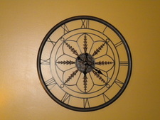
This is the clock that inspired my paintings. The canvases will be hanged on each side.
|
|
|
|
|
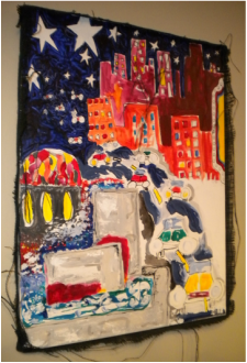
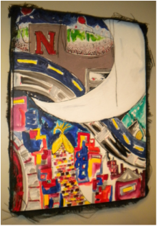
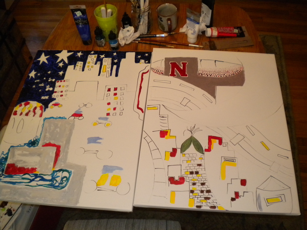
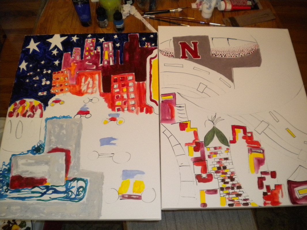
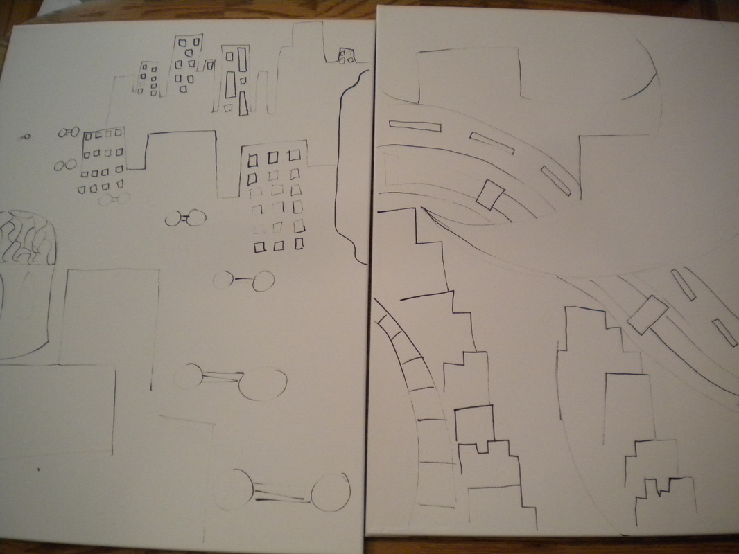
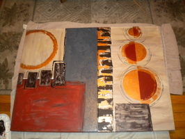
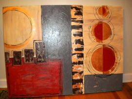
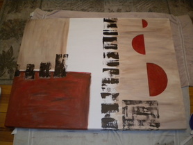
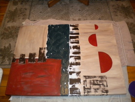
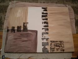
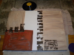
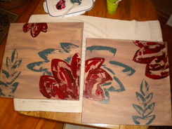
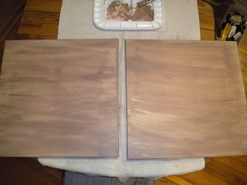
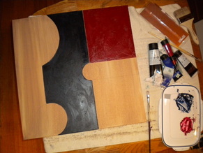
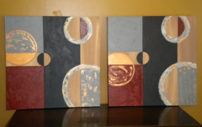
In Good Company
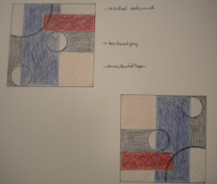
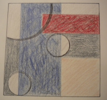
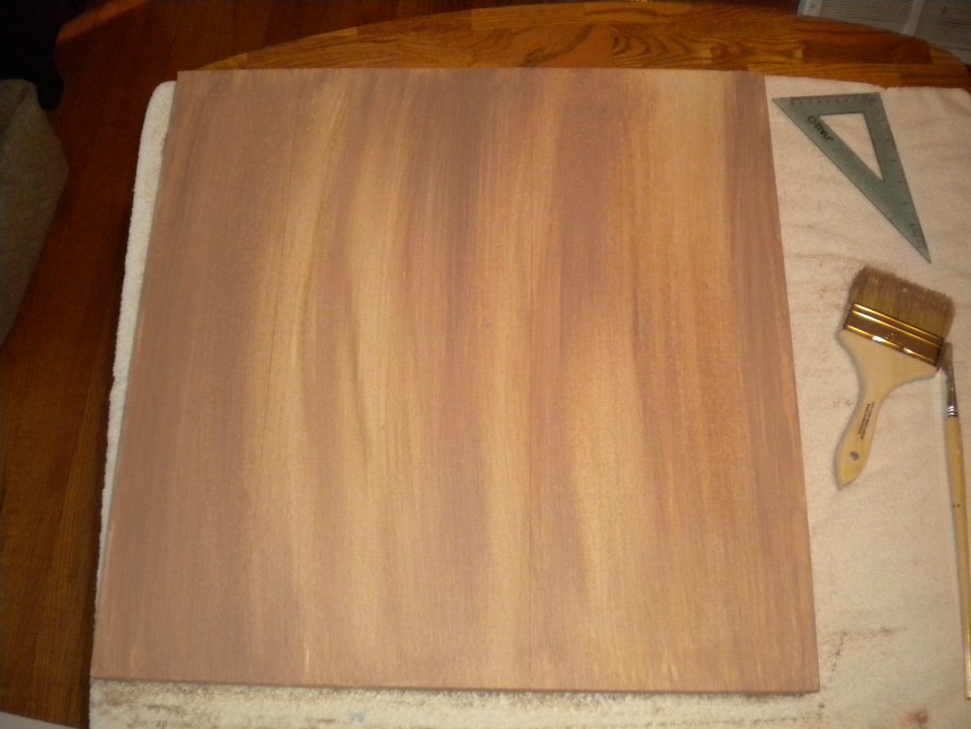
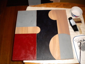
This is a new piece I am working on for a client. She wanted a piece to hang in her downstairs family room where they entertain friends and family. It is a huge wall space so we discussed what shape of canvas would look best and the number of canvases I should use. It is a very inviting family room with modern decor. So we decided that 2 24x24 canvases would compliment the modern decor. The rooms color scheme has deep blues, black and gray with scarlet red accents. So my sketch includes these colors as well as some warm neutral colors. There will also be texture used throughout this piece and the copper colored boxes represent the thin metal I will use on this piece. This will add deminsion and a little bit of brightness to the piece.
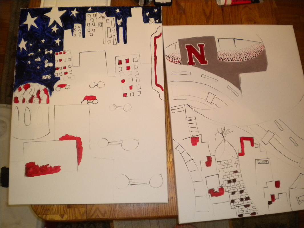
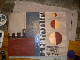
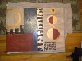
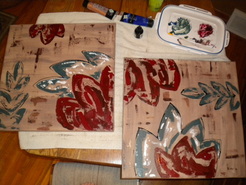
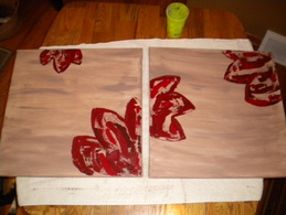
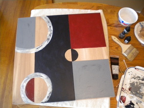
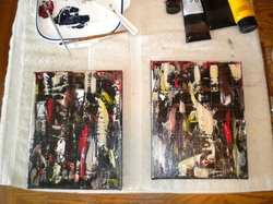
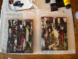
BELOW: I have started painting both canvases, but the only copper I could find was 4"x10". So I had to make some adjustments with the paint scheme. So the final design will vary a little from the sketch, but I think it will still look great if not better.
BELOW: I have started painting both canvases, but the only copper I could find was 4"x10". So I had to make some adjustments with the paint scheme. So the final design will vary a little from the sketch, but I think it will still look great if not better.
|
|
|
|
|
|
|
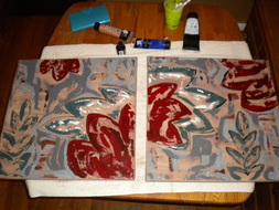
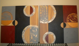
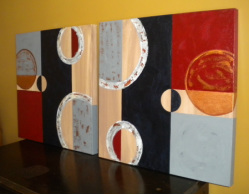
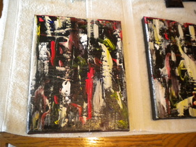
In Good Company (cont.)I had to post so many final pictures of this piece because after showing it to friends and my client I received great positive feedback. For example instead of using copper plates we decided to use copper paint, so I tried to show how awesome of effect a metalic paint has in a room. It plays with the light and looks different from every angle. The client also wanted the canvases to have subtle differences and honestly they are kind of difficult to notice right away, but both canvases are slightly different. (on display under Client Reviews)
|
On The Rocks
Sometimes it just fun to clean off your palette and your brushes, because you never know what you'll get! This was really fun to create, because I didn't think about what I was doing or what I wanted it to look like. In fact, this was a recycled canvas, because what I had painted on it previously sucked and was over thought and under painted. This is a style that may not be for everyone, but for how much color was used, when you see it in person it is actually quite subtle.
|
|
Leave In Teal
This is a piece that has a similar style of my leaves in charchoal. I went with the same basic leaf shape, but added more warm colors with cool accents. Once I put these in a dark frame it will have a great contrast and look very sharp. I really like how suttle the subject matter is, but the colors really make it pop.
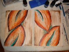
3 Seperate Projects
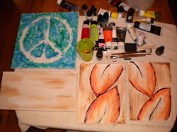
I am currently working on 3 projects. The Peace sign is a Christmas gift for my 9yr old niece and I still need to add some pink, orange, and green detailing. The plain canvas is going to be an abstract guitar and the two leaf canvases are for a client. I am also putting the finishing touches on 2 other works!
Reels and Ripples
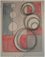
Here is a sketch for a client that wanted a piece to hang in one of her guest bedrooms. The client wanted clean lines and a modern look. The color pallet was pretty basic; gray, deep red, baige, blue.
Reels and Ripples
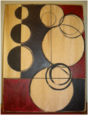
I started with painting the entire canvas a neutral baige color I mixed. I added a little water and applied several coats to give it a vintage feel. I measured and scored lines with a pencil and traced various sized circles. Then I mixed a rich scarlet red and a deep slate color used in the foreground. I then went back over the circles with ink and also stamped some circle prints. I think this piece is a nice mix of clean modern lines, but also has a great worn look. The client liked the use of negative space, because it made it more versatile in her home.
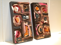
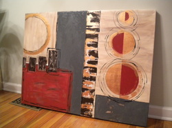
Abbs-tract
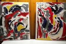
This client wanted a 2 canvas abstract piece that would be cohesive to the other decor already hanging in the family room. Some color choices the client preferred were; blue, gold, red, yellow... After I painted these canvasses the client and I viewed them in her home and we decided that the white needed to be muted a bit to match the vintage feel in the room.
Abbs-tract close-up
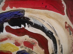
Here is a close-up to show texture. I use texture to show depth and dimension in my paintings. You can also see some of the dry brushing.
Abbs-tract
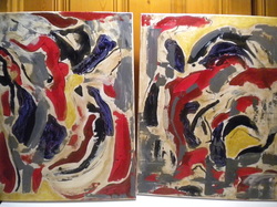
It is kind of hard to tell in this picture, but if you compare it to the first picture you can see I made some changes to the white background. I added a more vintage feel by "antiquing" the white canvas. I mixed a gold acrylic paint with warm neutral colors and used a slightly damp brush, so I could easily wipe the paint away if I thought it was starting to get a "muddy" look. I then mixed a neutral color and dry brushed that color over the entire canvas. Finally, I added some very small speckles of black to add age. I will post a picture when they are complete and hanging in the clients family room.
Abbs-tract displayed
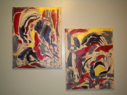
I like this pic, because it really highlights the gold wash I used on this piece.
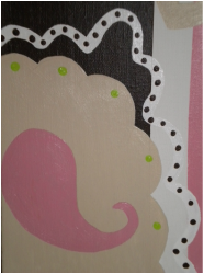
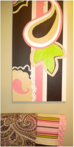
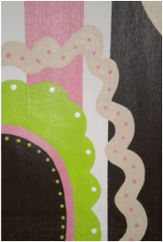
Baby Butters Nursery Piece
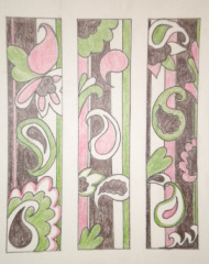
This is a sketch for my nursery project. The client decided to use 4 canvasses. The finished product will have detailing done in white. The inspiration came from the baby quilt and bedding that will be used in the nursery. This will be a challenging, but exciting piece to complete! I will keep my progress posted.
(on display under Client Reviews)
(on display under Client Reviews)
4 Canvases taped
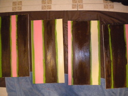
I primed the canvases, measured, and taped off the stripes. I used three coats of each color, so I had to let each coat sit for at least 24hrs.
Striped background complete
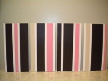
I really like how clean this piece looks. As I look at it, I find my eyes wandering back and forth over each canvas. Kind of like you can't really tell where one canvas ends and the other begins. I have each canvas numbered, but I am hoping that when this piece is complete, it will be very diverse with how the owner would like to hang it. The owner and I also decided that since the whole nursery is a soft green, I would use green very sparingly as an accent color.
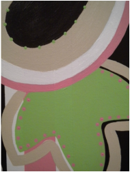
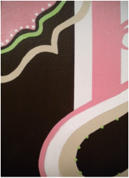
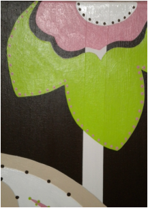
Baby Butters
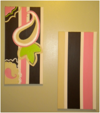
I drew and cut out my own patterns for this project. It took me a whole Sunday to paint the detailing on the canvas. I had to use several layers of paint and of course wait for them to dry. I then used a foam pen to do the dot detailing. It has been a fun challenge and I really like how this piece is turning out! Below is the baby quilt that was the inspiration for this piece.
|
|
|
|
