Portfolio
|
|
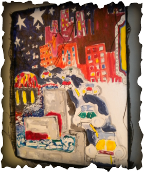
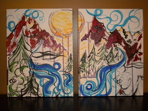
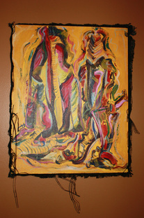
Under the StarsI created this piece for the Lincoln Library "Lincoln at Night" Exhibit. I didn't go downtown and sketch, or take pictures, I just wanted to paint images that were fun and funky. It reminds me of some contemporary folk-art. I wanted this to be a painting that makes you smile, ignites the imagination or takes you back to a memory of an amazing night out on the town.
|
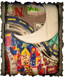
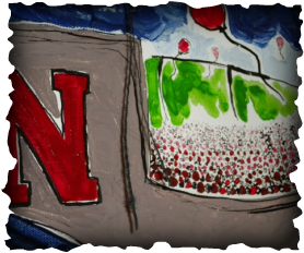
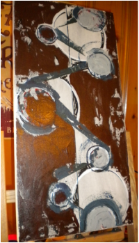
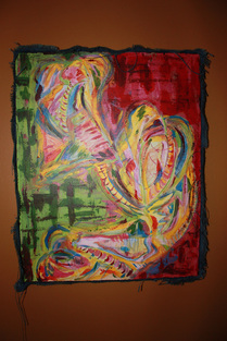
Over the MoonI created this sister piece for the Lincoln Library Exhibit. I wanted this piece to be just as loud as "Under the Stars". Some of my favorite memeories have been made touring the Haymarket and heading to a Husker game in the fall. You can hear trains, bustling crowds, cheers and people enjoying a night out. I also included "The Sower" on the right side of this piece, all that is visual is his arm and seed satchel.
|
Bubbles
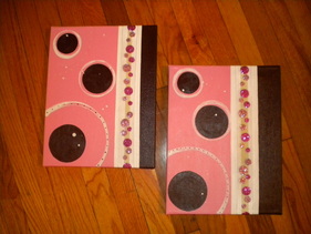
I created this piece for a a nursery. The crib set had pink, fusia, brown and white as the colors with little flower detailing on it. The room is going to have a polk-a-dot border alog the ceiling, so I added some polk-a-dot ribbon that sparkles. I think this piece is is all about a baby girl.
The Gathering Place
This is one of my biggest canvases to date! I created this piece for my parents family room. The room has lots of gorgeous neutral tones with a terracotta accent wall and deep rich colored furniture. I wanted this piece to bring out the accent wall and tie the room together. After friends and family looked at the piece many of them said they could see; piano keys, picture frames, gold mirrors, drinking glasses sitting on a bar, picture frames sitting on a dresser, etc. It was amazing how eventhough I didn't paint those objects consciously all of them can relate to items in the family room!
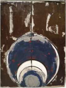
Starry Gaze for Hopeful Daze
I donated this piece to the Alzheimer's Gala. I created “Starry Gaze for Hopeful Daze” in honor of all who have been affected by Alzheimer’s. My inspiration for this piece came from often finding myself looking up at the stars in a sense of wonderment and often searching for an answer. Looking up and asking why? Sometimes drifting into a state of mind where all is right with the world. I hope this piece brings joy for all who see it and reflects a sense of comfort knowing there is always hope for the future.
Forever Home
I created this piece for my sister's living room in her new home. Her and her husband were very patient when it came to finding a house they wanted to call home, but after finding a house in the perfect location with a perfect yard, they had the tedious task of redesigning and updating the whole entire house! It was a long process, but well worth it. The house is beautiful and very inviting. They have truly found their forever home.
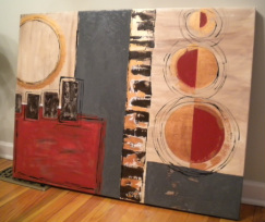
In Good Company
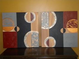
This client wanted a piece to hang in her downstairs family room where they entertain friends and family. It is a huge wall space so we discussed what shape of canvas would look best and the number of canvases I should use. It is a very inviting family room with modern decor. So we decided that 2 24x24 canvases would compliment the modern decor. The rooms color scheme has deep blues, black and gray with scarlet red accents. I was going to use copper plates on this piece but after great feedback from the client and a friend we decided that copper paint would look best. I am really happy about how this piece looks and how versatile it is. I feel like the client can hang them up and then turn the canvas a number of different ways for a new look.
(on display under Client Reviews)
(on display under Client Reviews)
On The Rocks
Sometimes it just fun to clean off your palette and your brushes, because you never know what you'll get! This was really fun to create, because I didn't think about what I was doing or what I wanted it to look like. In fact, this was a recycled canvas, because what I had painted on it previously sucked and was over thought and under painted. This is a style that may not be for everyone, but for how much color was used, when you see it in person it is actually quite subtle.
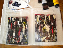
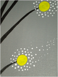
Let Go
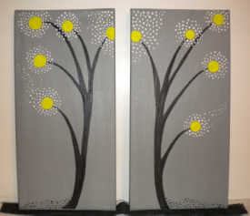
I wanted to use gray and yellow. So I painted the two canvases gray without knowing for sure what I wanted to do with the yellow. I then used ink to create the branch forms. I decided to use yellow at the tips of the stems and use white dots to create a whimsy feel. This is not a typical style for me, so I really enjoyed creating this piece and experimenting with a different style of artwork. I think this piece has a calming presence, the colors are very soothing and the detailed white dots look like they are floating away in mid-air.
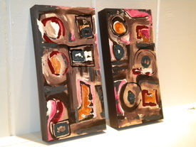
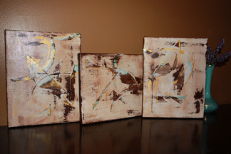
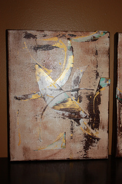
Gears in Time
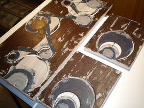
When I orignially thought up this design, I pictured real clean lines, perfect circles and bright bold colors that gave a modern flare. But after I started to paint and create this image on the canvas I did not like how it was looking. I thought it looked extremely juvenile, so I let it sit for a night. The following evening I decided I wanted a lot of texture, but wanted a cool color palette with subtle glimses of bold color. I wish I would have taken a picture of the original piece before I painted over it, so you could see the comparison. It was quite the transformation and I am much happier with this finished product. In the detail pictures below you can see the bold colors hiding behind all the layers.
|
|
Sounds Of Fall
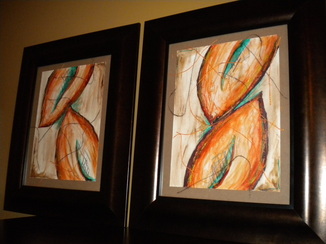
These were inspired by the Leaves In Charcoal (shown also in my portfolio) piece I created for my livingroom. My client wanted them to have warm colors, but he also like the color scheme I used in Leaves In Charcoal. So I added accents of teal to help bring out the rust and burnt orange. I then added gold detailing and some orange and brown burlap fringe to add deminsion.
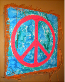
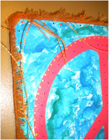
HippyHippyShake
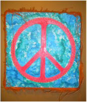
This piece is a Christmas present for my niece. I used ink to make the tie-dye looking background, then I traced a circle and hand painted the peace sign. I added dot detailing in orange and purple around the canvas edges and lime, orange and purple on the Peace sign. I then used orange burlap as the frame and frenged it so it had a retro feel. I think she's going to love it!
|
|
Baby Butters
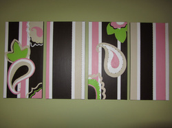
This piece was commissioned for a nursery. I was given a baby quilt for inspiration. It is four 12''X24'' canvases. There was a ton of detailing that went into this piece. I enjoyed creating it because it was a huge challenge to design. This piece had to have smooth and definite lines but still be playful...and you sure didn't learn how to make cute little polka-dots in art school. More detailed shots are listed under Custom Art-Works In Progress. (on display under Client Review)
Night With Friends
This is a piece I painted as a wedding gift for some dear friends of ours. They had many great memories of vacationing in Colorado and it's still one of their favorite places to visit. We met up with them a couple nights when we lived out there and we had the best of times with nothing but a warm fire, great conversation and the starry mountain night surrounding us.
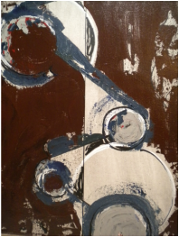
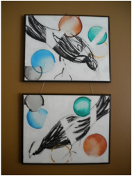
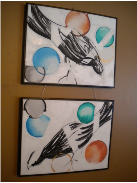
Reels and Ripples
The inspiration for this piece came from the couple who asked me to commission a piece for their guest bedroom. One of them is a musican and the other has a whimsical soul. So I decided to have some order in the piece as well as some funky edge. There are some brush fibers that dried to the background and it reminded me of watching old movies that have lint and fibers on the film, hince the title "reels". And the circles on the right reminded of the way tree branches drip into puddles on the ground creating ripples after a heavy rain.
Abbs-tract
I created this piece for a client, who wanted 2 original pieces to hang in her family room. This is one of my favorite pieces I have ever painted.
Leaves In Charcoal
This is one of the two pieces. I used newsprint, charcoal, ink, oil pastels, and burlap fringe. I created this piece for my living room.
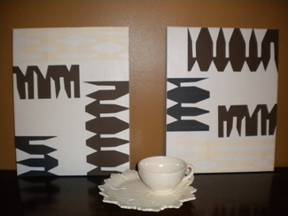
Gold Trio
After I painted a neutral background, I hand-cut funky shapes and used adhesive to get them to stick to canvas. I added demension using a deep umber with accents of gold and teal.
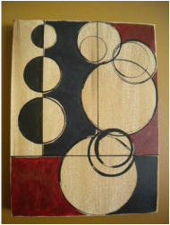
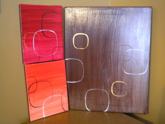
Circle Squares
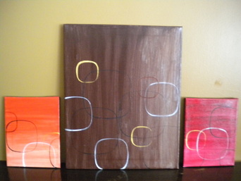
This painting is in a far different realm than what I am used to painting. It has a very modern contemprary feel. I mixed all the background colors so they are more original and applied a gloss finish. I then used a transparent ink and made some soft edged squares.
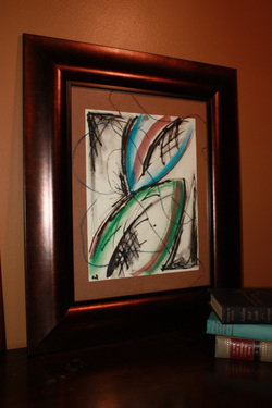
And Your Bird Can Sing
This piece was so fun to create. I went into it blind, I didn't analyze, I didn't over think, I just started to create. I think it has a unique whimsy feel. The material I used was ink and white acrylic. It has some texture and shine in the white background.
Grandma's Couch
This piece orginated after I cut out some patterns and went to throw the scrap paper away. I dropped a piece on the floor and thought that it made an interesting design. So I looked at some of the other scrap paper I had lying around and used that as the inspiration for my other patterns. I primed the canvases and then used adhesive to attach the designs I cut out of paper with and exacto-knife. I called it Grandma's Couch, because the pattern has a retro flavor...kind of like some "grandma" couches you might have seen or remember.
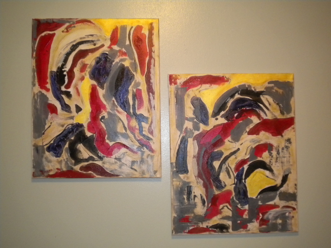
Sober
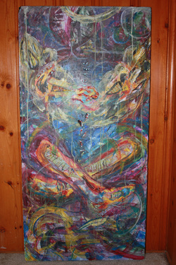
These 3 pieces were all created at different times. But they all tie together with the style of brush work and their brilliant colors. I entered the two bottom in a jurored art show while I was in college. Juror #1 received a second place honor for 2D mixed media. *NFS*
Juror #1 Juror #2
|
|
Rhonda #1 Rhonda #2
I created these 2 pieces years apart. But I felt like they were both very similar and had the same subject matter.
|
Rhonda #2 was a happy accicdent. I was painting over a canvas that had a landscape originally on it and I liked how the blues and purples of the sky looked with the red, so I kept most of that visible. I used ink for the silhouettes.
|
FadeD
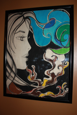
This piece was inspired by lyrics my husband wrote for a song. The girl is actually in the foreground; I cut her silhouette out with an exacto-knife after I drew her on the newsprint. It was challenging since newsprint is so delicate. I used oil pastels and charcoal sticks for the background, I then used spray adhesive to attach the silhouette.
Colorado '08
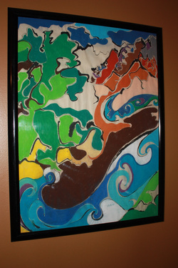
The inspiration for this piece came from my husbands summer job in Colorado. When we first started dating he ended up moving out to Colorado for the summer to bartend at a guest ranch. I went to see him once a month. I ended up moving to Fraser, CO after the summer was over so we could be together. He purposed in our little one bedroom condo exactly one year after first meeting me. We love Nebraska, but part of our heart will always belong to the mountains. I used ink and oil pastels to create this piece.
